
Westmoreland Project Reveal | the Kitchen

Its hard to find the words to express how much we enjoyed designing this home. Gracious in scale and with good bones, we were given an empty palette to create something beautiful and meaningful that would live on with this family for years to come. Taking note of the home’s location - Southeastern Virginia - the style of this project could be described as a sort-of Southern, coastal, new-traditional style.
Trading their old home for one right across town, our clients - a young family of seven - were ready for something with a bit more space! Having helped with the design of their last home, the Stoney Creek Project, they were kind enough to ask us to help them with their interior design of their new home, the Westmoreland Project. Focusing on the: foyer, living room, dining room, kitchen, home office, and master bedroom, we were able to take what was once a dark, dated house and turn it into something beautiful, warm and light.
When we first walked into the Westmoreland Project kitchen we were blown-away by the size - its HUGE?! However once we got over that factor, we quickly took in all the less-than-desirable features… beige walls, black back-slash, dated light fixtures. It had great bones but it certainly needed a refresh! Now, what was once a dark and dated kitchen is fresh and up-with-the-times.

BEFORE:

As you can see this kitchen is HUGE! While the appliances were up to par and the layout fine, we knew that we definitely wanted to give things a bit of an update.

In this area we planned on placing a farm-house style table from the client’s previous kitchen, with chairs and a bench on either side.

AFTER:

I mean… WOW! We cannot get over how much some paint, new backsplash, new light fixtures, and some styling transformed this kitchen!!! While before it was dark and dated, now its up to speed with the times while still fitting in with the traditional bones of the home.

One of the major changes that we made to this kitchen was changing up the wall color using Benjamin Moore Shoreline 1471. This is one of our favorite light-gray paint colors as it is quite serene (and looks great next to stainless steel appliances!).

The backsplash was another “small” but significant change that we made to this kitchen design. Before it was quite dark, heavy and well… ugly. We decided to swap it out with something fresh and light. Loving all of the zellige tiles out there right now, we selected something from Lowes with a similar vibe; a subway tile with variations of light-grays.


Oh my goodness y’all, this nook… Speaking frankly, we had no idea: 1.) why it was here and 2.) what to do with it?! For a while we toyed with the idea of putting a beautiful hutch in it or a large linen bulletin board before finally landing on coffee bar. Being one (our client) who likes to keep her counters clear, this was a perfect idea! We styled it simply with these beautiful pieces of art featuring white coral fans on a linen matting.

It was important to bring a bit of texture and warmth into the space, so when it came to the counter-stools we went with these woven/black metal ones.


When it came to the lighting, we wanted to select something that was simple, fresh and that would sort of blend in with everything else. Swapping out the existing fixtures, we replaced them with brushed nickel and glass pieces.

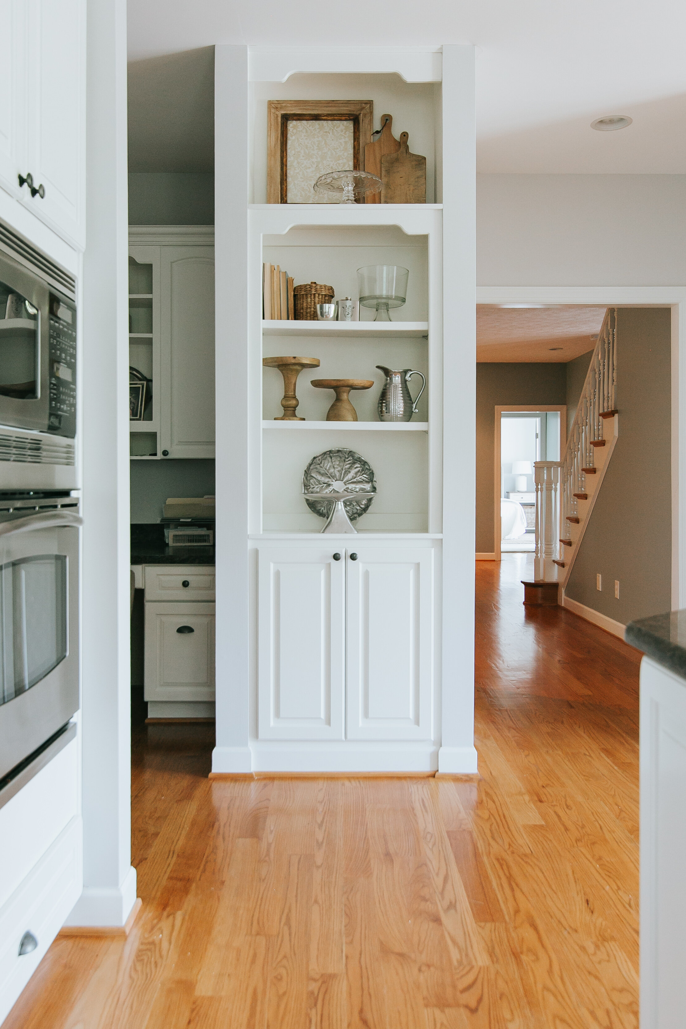
We took the advantage of these kitchen built-ins to display special, family heirloom pieces mixed in wooden cutting boards, pie stands, etc. The kitchen is first and foremost a functional room but how it looks matters!


INTERIOR DESIGN: Making Room for Peace | PHOTOGRAPHY: Jenna Miller Photography


Something I love is having friends and family over. Whether planned or spontaneous, the door is always open! When Martin told me we had some people coming over last night, I quickly got some things together to make a beautiful, simple meal.