A New Season Ushers In New Colors
The past few months I've noticed an interesting pattern in myself in that I've been drawn to lighter colors over darker colors. While I've always appreciated bright hues such as pink and turquoise, they're not something that I would generally choose when it comes to fashion or designing a space. Ever since I was young and particularly in college, I've been drawn to the chic, sexy, and timelessness of the color black. It goes with everything, it's slimming, and it's comfortable. It's safe. Color on the other hand takes courage. To me, it requires more of an investment. By wearing color you are saying to the world, "look at me! I am a confident and vibrant being."
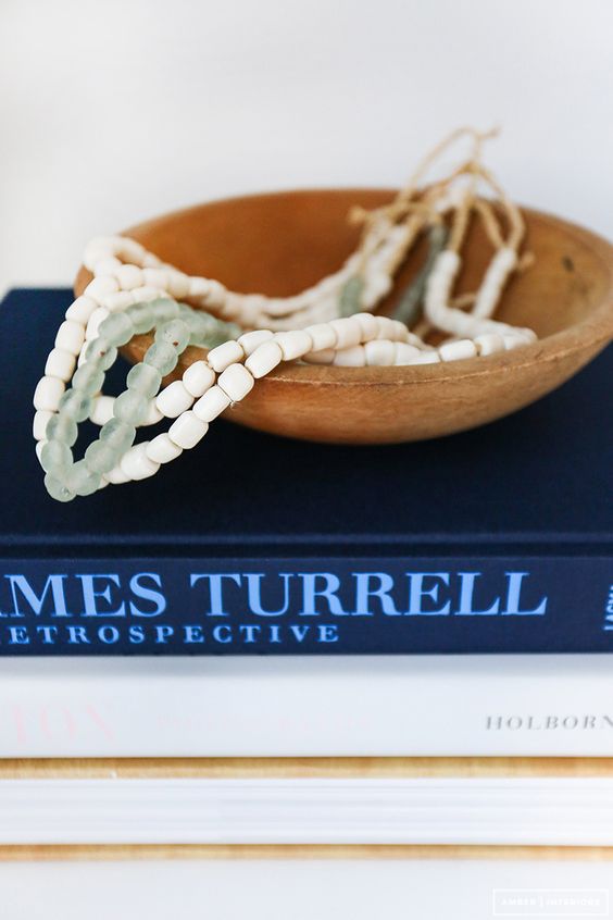
I brought up this odd pattern to my co-worker the other day. It was just so unlike, that I thought it quite odd. After explaining the situation to her, she turned to look at me and with compassionate eyes said, "isn't it interesting how we are drawn to specific colors throughout specific seasons of our life? You have just come out of a season of grieving.. So now you are more accepting of color." Her words caused pause in me as I reflected over the past year. It is true that the past several months have been a time of growth and rejuvenation, as I've spent time reflecting and healing. I looked inward and released, I made room for peace. As I drove home that evening I was filled with excitement and hope by what my co-worker had shared with me that day. I began to envision what this new season of life would hold, what I would feel. Already, I could see my grief and anxiety subsiding, instead sprouting up feelings of joy, health, peace, love, and fulfillment. I considered the colors that I've found myself gravitating towards: pink, white, turquoise, and green; reflecting on the meaning behind them and how I can incorporate them into my everyday life.
BY WEARING COLOR YOU ARE SAYING TO THE WORLD, "I AM A CONFIDENT & VIBRANT BEING."
WE ARE DRAWN TO SPECIFIC COLORS AS WE EXPERIENCE SPECIFIC SEASONS IN LIFE.
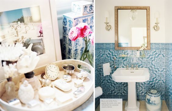
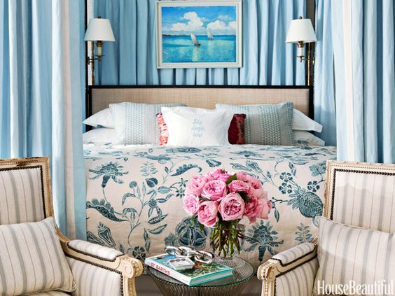
B L U E
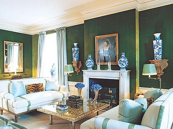
The color blue is the color of authenticity, tradition and order. It is a beautiful color to paint a room or a ceiling due to it's calming effect and ability to match with every color. This color is known to bring peace and harmony.
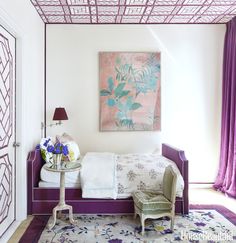
P U R P L E
The color purple is a color a sophisticated color that encourages you to connect on a higher plane and to brings fresh perspective on emotional issues. By reminding you that we are all connected, it deepens your sense of humanity. Add some purple to your home with the addition of flowers or a piece of art.
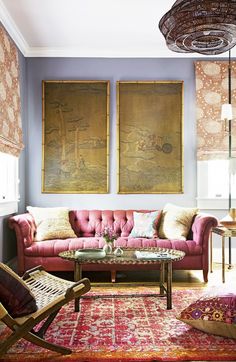
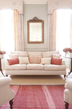
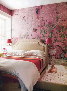
P I N K
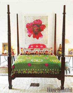
This gentle, comforting color opens the heart and encourages love. Its a beautiful color to use in times of transition as it soothes and nurtures. Incorporate the color pink into your home through a rose quartz crystal, dishware, or a throw.
R E D
The color red is the most stimulating of colors. It promotes confidence, sexuality, and passion; however having too much red can overstimulate you. I enjoy using dashes of red in small accessories, books, and pillows.
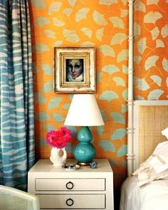
O R A N G E
The color orange is the color of comfort. It is a warm, happy color that encourages balance and vitality. It is a beautiful color to incorporate through floral arrangements and textiles.
Y E L L O W
The color yellow is the color of intelligence and focus. It encourages conversation and can help to clarify thoughts. Add a splash of yellow to your space by using it as a wall color or in accessories. From about the age of 9 to 13, my room was painted a soft yellow, that I absolutely loved. When the natural light came in through the windows, the space glowed.
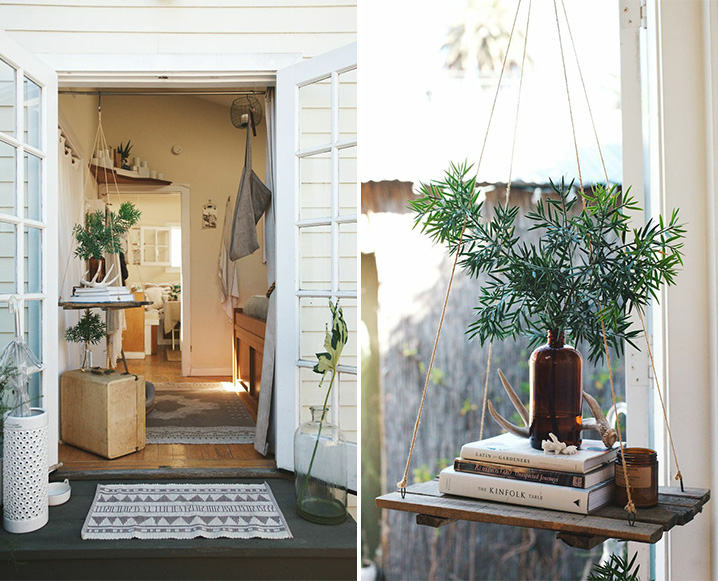
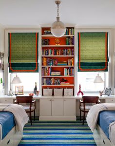
G R E E N
The color green is the color of growth, wealth and healing. It represents nourishment and stability to the body. You can use this rejuvenating color in your home with the introduction of plants. You'll be amazed how much life a dash of green can bring to your space!
We are excited to announce that Making Room for Peace is featured in this month’s issue of Northern Virginia magazine!
Our client’s vary when it comes to their style and budget but one thing that they all have in common… decision fatigue. Whether they come into the project with it or pick up a case of it later on mid-renovation, its our job to come alongside them to help navigate and eliminate as much of it as we can.
One of the things that I loved about working with this particular client is how organized they were, as well as their amazing style! A mix of traditional and modern, with a touch of coastal; it was right up our alley.
Fast-forward to my late twenties, when I started MRFP, where I brought this holistic approach to our business. At the end of the day, I don't just want to create "pretty interiors", I want to design spaces that..
Having bought this home years back, its steeped in memories of days out on the water swimming and fishing; enjoying a meal together in the kitchen; taking a siesta on the sofa. You can bring that same feel to your own home by shopping the look below!
The thing is, everyone has their own definition and idea of what constitutes as “traditional” or “coastal” or “modern". We want to figure out what that means and looks like to you.
If you taken a look at our design process when it comes to full service decorating and full service design, you may have noticed that we have two different types of meetings listed - the first being a “vision meeting” and the second, a “design meeting”.
Some days and weeks are busier than others, depending on where we’re at with our projects, however for the most part this is what a day-in-the-life looks like for me.
If you follow us on the blog or on social media, you may have noticed that its been a minute since we’ve shared about any new projects. The truth is that we’ve had a very busy year, with projects all across the state (as well as our first one in DC!) but due to the nature of the work, their timelines are on the longer side.
This service is ideal for the client who would like an expert to guide them through the design process (creating a design plan, ordering, installing, etc.); but who isn’t looking to do any renovations.
Two hours of on the spot design advice and expert styling tips, our Consultation is perfect for the client who needs direction but isn’t yet ready to commit to full service decorating or design.
Collaborating with Hound & Sparrow Films this past summer, we partnered to create this beautiful video, sharing the heart behind what we do here at Making Room for Peace.
As someone who is deeply inspired by beautiful food and interior design, one of my favorite things about living in Northern Virginia is access to so many restaurants! Housing some of the most ingenious chefs in the country, there is no end to the creativity and variety of food to enjoy.
While full service decluttering is about a quarter of our business (the other percentage being interior design), it is something that is near and dear to our hearts. Today we’re sharing a recent project that we completed with a family of five last year.
If your familiar with our work here at Making Room for Peace, then you know that when it comes to all of our design projects, we love to go custom! The design of the Harfield Project was no exception. Today we are breaking down seven ways where we went custom.
Out of all of the rooms in the house, the sunroom is definitely the place to be! Between the comfy seating, the amazing view of the river and the bar… this room is all about relaxing and having a good time.
When it came the design of the great room, we kept the base of it neutral but then brining in layer after layer of pattern and color. The effect feels thoughtful and lived-in.
We are excited to announce that Making Room for Peace is in the January/February 2022 issue of Coastal Virginia magazine! You can read the full article here and/or pick up a physical copy at your local Barnes & Noble.
It’s no surprise that after the past few years we’ve had, people are longing for peace and calm. This trend is very much reflected in the color of the year - green.
I have to admit, I’m usually not one for “design trends” but the ones predicted for this coming year have me excited!
Walking into the Toano Project master bath you immediately feel as if you walked into a spa…
We wanted to find a balance between doing something fresh and designing a bathroom that incorporated those classic elements of the Old Hollywood-type looking bathrooms with the beige and black tile and brass light fixtures.
Today, we are walking you through the “before” and “after” of the Toano Project kitchen reveal! I have to say, that this reveal is probably our most dramatic yet.
Like a lot of people, my Toano project clients found that after months of being home due to Covid precautions, they were ready to do something different with their space!
As we headed into 2022, we’re making a few tweaks and changes to our design services that we offer. We are going to be implementing a 3-tier system for our design services, to better accommodate our client’s varying budgets and needs.
So I know I said that Office 01 was one of my favorite offices at Cedar Counseling & Wellness, but Office 07 IS hands-down my favorite. Moody, modern and masculine… I definitely wouldn’t mind working here every day!
Probably the most “peaceful” out of all the offices, office 06 is certainly a calming retreat. Painted a soft, mossy green, the inside almost blends in with the outside.
When looking at this office, most people would look at it and say, “yeah, this was definitely designed by Making Room for Peace.” With nods toward our signature California-coastal style, office 05 is certainly a peaceful retreat.
“I feel as if I stepping into a spa,” our client recently remarked. “It’s just so peaceful and elegant.”